

We're loving the mix of feminine colors with grungy textures, dark surfaces and harsh lines.
Painting by Lisa Madigan, Blackberry Sage Spritzer, Crop Typography, Room, Rings, Flowers
We're loving the mix of feminine colors with grungy textures, dark surfaces and harsh lines.
Painting by Lisa Madigan, Blackberry Sage Spritzer, Crop Typography, Room, Rings, Flowers
Although our initial thoughts of summer lean toward bright colors and warm patterns, the other side of summer offers a palette of {cool vibes} grounded by earthy hues from our weekend adventures. The moments ahead of us are promising to be filled with smooth drinks, inspirational projects, and time to breathe in fresh air, so there's no doubt that we're taking them on. After all, embracing the moment isn't so hard when the moment is full of natural aesthetic.
Warby Parker Glasses Wild Hair Thrive in Truth Gardenias and Mint Organized Entryway Mountains
Mobile // 1440 x 900 // 1680 x 1050 // 1280 x 800 // 1260 x 1440
Because, let's face it, summer is hands-down the the best time to kick back, soak up the sun and indulge in nature's candy.
Herbivore Botanicals Pink Clay // Flowers // Grapefruit Sorbet // A // Face // Grapefruit Glazed Donuts
This season, you can find the ladies of Style-Architects hanging on the softer side of the color spectrum. Whether we are infusing these {pretty} pale pastels into our wardrobe, makeup routine or incorporating into a client's brand, these unsaturated brights have stolen our hearts. Jump on over to our Pinterest page for more of what adds pep to our step or if you are in need of some early-week inspiration.
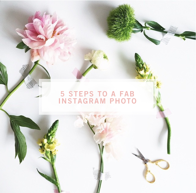
Do you ever scroll through your Instagram feed and long for your gallery to look like the ones you see from your favorite brands and companies? It's not too difficult to spruce up your IG profile, it simply takes a little practice. At SA, we've had plenty of practice crafting Instagram shots for our clients, so here are a few tips to nail your next Gram-worthy moments:
1 — Set your phone’s camera to ‘square’
Trust us, this will make your gramming life immensely easier. If you take photos already in ‘square’ format, it will save you the hassle of cropping later and missing a crucial part of the photo.
2 — Find a unique + intriguing way to take a shot
Whether it’s styling it up or finding a neat background outside, the difference between a good looking Instagram photo is, well, the quality and uniqueness of the image. Tip: think outside the box, sometimes the most worn down and unexpected places make the best backdrops.
3 — Tap your screen to get the correct focus + brightness (PS — lighting is everything)
That little square on your camera isn’t there just to be annoying, it’s there to help you focus the shot. You will notice if you tap around the screen, the square will move there and it will change the perspective of the photo.
4 — Take more than one photo
Have you ever been somewhere and thought you got a really good image but you went back and looked later and realized it was blurry? Join the club. Take a couple images to make sure you capture a good one.
5 — Edit before you edit
This sounds crazy, but it’s important. Taking a peek at your photo before actually taking it to Instagram is helpful in order to get the best possible version of it. We love VSCO, afterlight, and snapseed!
Check out what we've done lately for a few of our clients!


We're dreaming of fruity drinks and sunshine for the week ahead!
Spiked Watermelon Rosemary Punch | Triangle Pattern | Waterfront home in Venice | R | Popsicles | Izze


